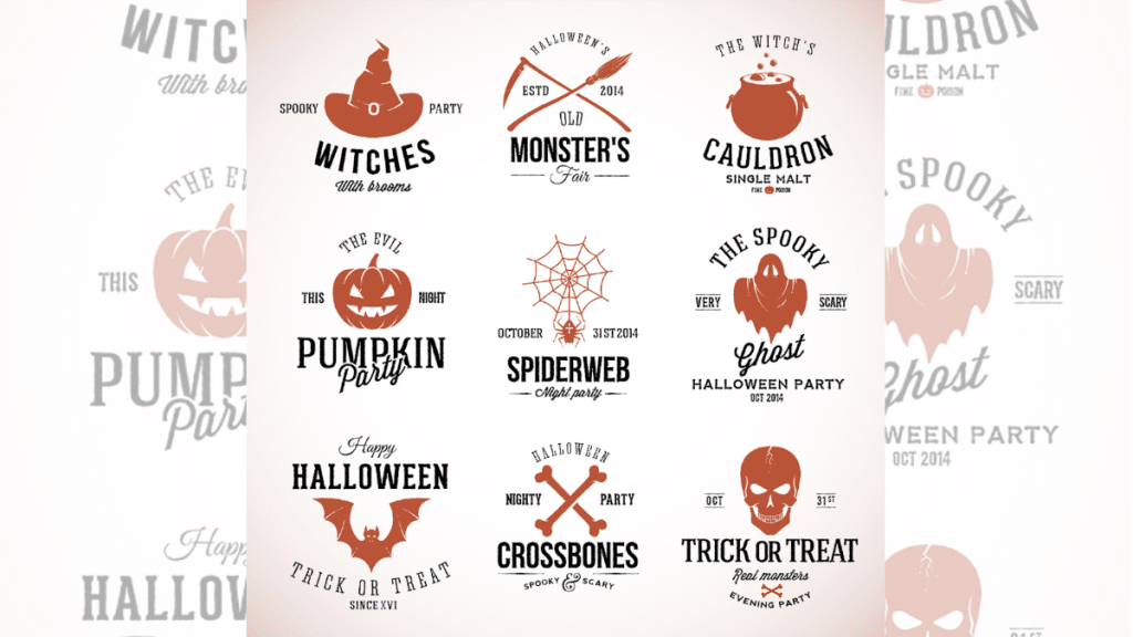
Boo! Okay, don’t panic. We’re just in the Halloween spirit over here. As we deck out our homes with faux cobwebs and carved pumpkins, there’s another transformation that’s taking the business world by storm called seasonal branding.
Now, before you roll your eyes and think, “Just another marketing gimmick!” hear us out. Halloween is a golden opportunity to inject a little fun into your branding, making it fresh and captivating for your audience. Ready to give your logo a spooky makeover? Let’s unravel the tricks and treats together.
1. The Rise of Digital DIY: Meet the Logo Generator
If you’ve stepped into the business world in recent years, you’ll know that digital tools are nothing short of wizardry. One such sorcery at your fingertips is the logo generator.
Gone are the days when you needed a Ph.D. in graphic design to tweak your company’s emblem. A logo generator is your modern-day magic wand, allowing you to transform and play with your brand image at will.
Why hop on this digital broomstick? For starters, it’s swift and efficient. You can try out dozens of designs in mere minutes.
Plus, it’s all about customization; you can adjust every little detail to your heart’s desire, ensuring your brand remains unique and memorable. As we venture into the realm of Halloween-inspired branding, a logo generator can be your spellbook, conjuring up a bewitching logo in no time.
2. Deciding on Halloween Elements for Your Logo
Before we dive into the cauldron of creativity, a little disclaimer: It’s essential to choose elements that seamlessly fit with your brand. Think of it as dressing up for a Halloween party; you wouldn’t just throw on any costume, right? It should resonate with your personality while still turning heads.
That said, some timeless symbols ooze Halloween charm, such as eerie pumpkins with mischievous grins, silhouettes of witches soaring against a full moon, stealthy bats, or friendly ghosts saying “Boo!” But remember, the goal isn’t to transform your logo into a haunted house.
It’s all about balancing festivity with professionalism. You want your customers to smile, recognize your brand, and appreciate the festive spirit, not wonder if they’ve stumbled upon a horror movie set.
3. How Can You Use Color Psychology for Halloween?
Ever stopped to wonder why certain Halloween colors give you those spine-tingling vibes? Colors are like the secret ingredients in a witch’s brew in that each adds a unique flavor. Halloween is synonymous with oranges, blacks, purples, and greens. But what’s the magic behind these choices?
Orange stands as a symbol of creativity, warmth, and that festive, fun-filled vibe. Black, on the other hand, speaks to the mystery, elegance, and depth of the unknown. Purple? It bridges the gap, a mix of the energy from red and the calm of blue, often synonymous with magic. And green, you can think of as the color of surprise, from unexpected potions to glowing monsters.
When sprucing up your logo, consider how these colors can be harmoniously blended with your brand’s existing palette. It’s not about a complete overhaul but sprinkling in a dash of Halloween charm.
4. Incorporating Spooky Typography
Font fanatics, unite! Typography is like the costume your text wears, and during Halloween, it deserves its own mask or cape. But tread cautiously; while you might be tempted to go for that font that looks like it was scratched out by a zombie, clarity is key.
First, think about the message you want to convey. A font dripping with ‘blood’ might be perfect for a haunted house event but might feel out of place for a bakery unless you’re selling some deliciously creepy treats!
Consider fonts like “Creepster” for that classic scary feel or “Nosifer” for a touch of eerie elegance. Just remember to balance style with readability. A font can be as spooky as a ghost story, but if your customers can’t read it, the story falls apart.
5. Subtle vs. Bold: Striking the Right Balance
Here comes the tricky bit. Imagine you’re at a Halloween party; some folks are in full-on zombie makeup, while others rock a subtle cat-eye look. Similarly, your logo can either scream Halloween with every pixel or whisper it with a gentle nudge.
If your brand is playful, perhaps those bold, dramatic changes fit right in. But if you’re more on the conservative side, subtle might be your best bet. Maybe it’s just about adding a tiny witch hat to your logo mascot or tweaking the color to a more autumnal shade.
It’s crucial to know your audience’s appetite for change. After all, while we all love a good scare, no one wants to be genuinely terrified, right?
Spellbinding Sign-Off
This Halloween, let your logo bewitch and bedazzle. Embrace the spirit, make a memorable mark, and watch your brand cast its enchanting spell all season long. Happy haunting!
