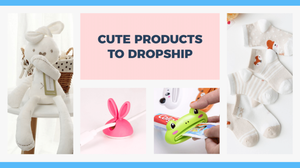
If you want to get started in the world of e-commerce, dropshipping is often the easiest and most effective way to make money. If you’re unfamiliar with the process, dropshipping is when you work with a third-party supplier to package and ship your products. This process works well because you don’t have to maintain a vast inventory or worry about shipping costs.
Although dropshipping is a straightforward business model, you need to market your brand aggressively to succeed. Fortunately, we’ve compiled a list of seven tips for branding your dropship store. So whether you’re just starting or need to kickstart a slow sales period, here’s what you need to know.
Why Branding Is Important for Dropshipping
Because dropshipping is easy to get into, many e-commerce stores are online today. In addition, platforms like Shopify and Fulfillment By Amazon (FBA) enable users to start a business practically immediately.
So, with such fierce competition, you need to work harder to stand out. Also, you’re not just competing with other small dropship companies — you’re also going head-to-head with giants like Walmart and Amazon, who dominate in the e-commerce space.
While this competition can seem overwhelming at first, it helps to know that demand for online shopping is at an all-time high and doesn’t show any signs of decreasing. In 2022, the industry is projected to make over $1 trillion overall, which is a new record. So, there’s no reason you can’t get a piece of the action.
How To Brand Your Dropship Store
Step One: Define Your Brand Personality
If you want people to connect with your brand, you have to make it seem warm and inviting. One of the best ways to do that is to attribute human characteristics to your company through a brand personality. These days, customer loyalty is higher than ever, and brands that can engage with consumers personally are reaping the rewards. Some examples of brand personality types can include:
- Authoritative – In this case, you want your customers to understand that you know what you’re talking about and have lots of experience. Typically, businesses like law firms or investors want to emulate this personality.
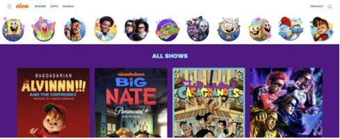
- Whimsical – Your brand can convey fun and excitement, giving users joy whenever they interact with your company. One perfect example of a “whimsical” brand is Nickelodeon, which gears toward children and family entertainment.
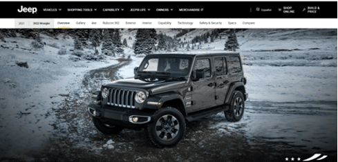
- Rugged – Some brands need to be tough and dependable, especially when the environment is harsh and unforgiving. Brands like Dickies and Jeep have “rugged” personalities that help define their products. Other descriptors for this persona include “outdoorsy” or “natural.”
- Sophisticated – Plenty of luxury brands offer sophistication with all their products. Think of companies like Gucci, Versace, and Tiffany & Co. When customers wear these brands, they feel elegant and high class.
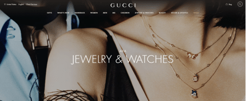
As you can imagine, you can capture one of these personalities for your dropshipping store pretty easily. For example, if you sell outdoor and camping products, you can adopt a more rugged persona. If you sell jewelry and fashion accessories, you can offer sophistication with each purchase.
But, how can you incorporate a brand personality into your store and marketing elements? Here are a few tips:
- Come Up With a Mission Statement – Why are you getting into the e-commerce industry? If it’s just to make money, customers may see right through that. Instead, you need to figure out what you’re trying to achieve then incorporate that into your persona.
- Narrow Your Product Selection – If you want to be a “whimsical” brand, it doesn’t make sense to sell high-end jewelry. While some dropshipping stores try to sell as many products as possible, it’s often better to focus on a specific niche.
- Write a List of Keywords – Once you know your persona, you want it to permeate every page and product description. One easy way to do that is by writing a list of keywords that you can use throughout your website. For example, sophisticated keywords can include luxury, class, elite, executive, Haute, and more.
Step Two: Define Your UVP
UVP stands for Unique Value Proposition, and it’s a crucial part of any business venture. If you want your dropship store to stand out among a sea of competitors, you need to figure out what makes you unique. Without a solid UVP, you’ll be facing an uphill battle, and it will be much harder to succeed.
How can you develop a UVP? Here are some ideas, based on real-world examples:
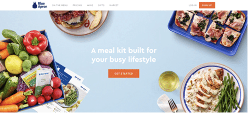
- Break New Ground – There was a time when making recipe-heavy meals required you to write a list and go to the grocery store. Then, Blue Apron came along and changed the game with on-demand meals delivered to your door. Now, instead of searching for ingredients, everything comes pre-packaged and ready to go. Currently, there are tons of at-home meal services.
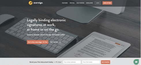
- Offer Convenience – Getting signatures and filling out paperwork used to be a time-consuming and challenging process, especially if you needed a signature from someone far away. Then, companies like Eversign started offering a faster solution, thanks to technology. Now, businesses and individuals can get legally binding signatures with a click of a button.
- Share Knowledge – Most e-commerce stores simply offer products, and that’s it. However, you can go a step further and show customers how to use these products to solve problems. Educational content is hot right now, thanks to companies like Masterclass, which offers instructional videos from world-renowned experts. This way, your site can become a resource, ensuring you get more visitors.

Once you’ve defined your UVP, be sure to promote it on your home page and About Us page. Ideally, you can distill the proposition into a single line, aka an “elevator pitch.” For example, “delicious recipes delivered to your door” or “learn from the world’s best.”
Step Three: Design Your Own-Brand Logo
Now that you have your brand personality and UVP, it’s time to start crafting a high-quality logo. Fortunately, getting a new logo for your ecommerce store has never been easier, and it’s also pretty affordable. Before investing in a logo, though, keep these elements in mind:
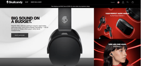
- Text vs. Graphic-Based Logos – A text logo ensures that customers won’t forget your brand, but a graphic may be easier to recognize, and it’s much more unique. One example of an excellent graphic logo is Skullcandy, which sells headphones and other audio equipment. You can also combine the two for a more engaging logo.
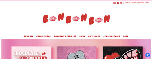
- Capture Your Brand Persona – If you’re promoting yourself as a rugged brand, you don’t want to use a delicate script font. Overall, your logo should represent your brand personality as much as possible. One example is Bon Bon Bon, which uses bright red lettering and lip icons to show that the company sells French-inspired treats.
- Icons Based on Name or Products – The most famous example of a brand logo that relates to the company name and not its offering is Apple. However, in the e-commerce space, another good example is Black Diamond Equipment, which has a diamond icon next to its name.

- Keep it Simple and Memorable – One crucial way to develop a captivating logo is to research the competition to see what they’re doing. Then, you can determine if your logo stands out or just blends in with the rest. Overall, you want to make your logo unique and easy to remember. Ideally, a customer should recall your brand after seeing it once.
After coming up with some logo ideas, where can you turn those ideas into reality? Here are the best options for logo creation:
- Freelancers – A freelance marketplace like Upwork can connect you with tons of graphic designers.
- Logo Generators – A logo creator like Tailor Brands enables companies of all shapes and sizes to create logos immediately with no design skills.
- Design Software – If you have some graphic design experience, you can take a crack at designing your own logo with a graphic design software like illustrator.
Step Four: Consider Your Color Scheme
Your logo is just one component of your overall brand. When building your e-commerce website, you have to consider how color can impact the look and feel of each page. Understanding color theory can help you craft better-looking product listings and pages, and it can make your site feel much more professional and polished.
Here’s a quick overview of the colors that fit with different brand personalities:
- Authoritative – You want colors that feel sturdy and reliable. Black, white, dark blue, and gray can convey these feelings. For example, Masterclass’ site background is black with a white logo.
- Whimsical – In this case, you want bright colors to make your pages pop. Orange, green, pink, and purple can add some fun and whimsy to your pages. Neon and pastel colors will also add to the experience. Think of the orange Nickelodeon logo.
- Rugged – Earthy tones can make your brand feel more rugged and outdoorsy. So, dark green, brown, black, and gray can work well. Consider the color palette for Jeep or Patagonia.
- Sophisticated – You want to make your customers feel like they’re in a high-end boutique when visiting your shop. As a rule, lighter colors can feel sophisticated, like the baby blue of a Tiffany box. Other color examples include gold (or yellow), light blue, red, and purple.
A colored logo can serve as the foundation for your site’s color scheme. Also, consider the colors most associated with your products. For example, if you sell baby clothes and toys, you might want to use light pinks and blues. If you’re unsure which color scheme will work best, you can conduct A/B testing and see which page gets the most engagement.
Step Five: Invest in Designing Your Core Pages
As an e-commerce store, your “core” pages are your homepage, about us page, and product pages. Here are some tips on how to craft each one correctly:
Homepage Design
Since this is the first thing people will see, you need to ensure that you convey the right message immediately. It should be clear what you offer and what sets you apart from other online retailers. One example of this is No Bull, which puts its products front and center. The layout is simple and highlights the fitness aspect of the brand.
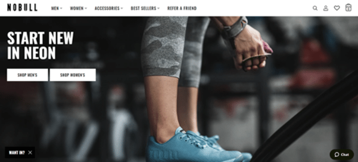
The homepage is where you can showcase some of your top-selling items. Also, you should put your UVP description “above the fold,” meaning that users don’t have to scroll down to see it. Finally, make your other pages easy to see. For example, you can break down your products into specific categories (e.g., shoes, clothing, men, women, etc.) to make it easier for users to navigate.
About Us Design
Here is where you can dive deeper into your UVP and mission statement. Your About Us page is where customers will get to know you better, so what kind of message do you want to convey? What are the essential elements of your business, and what makes you want to sell these kinds of products?
An easy way to make your About Us page more personal is to showcase the team behind the brand. Even if it’s just you, you can showcase your motivation for starting the business and what you hope to achieve.
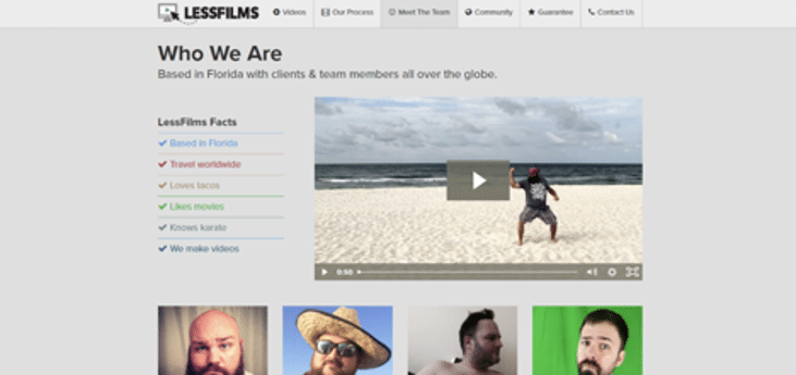
One excellent example of an About Us page is LessFilms, which offers a quick snippet of personality traits along with a video of their story. This page works well because the company is a video content producer, so it makes sense that they would share information via video.
Product Page Design
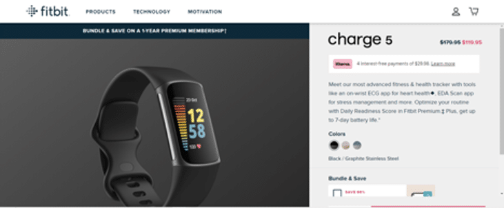
Each product listing page should include specific information, such as:
- Product price and shipping costs
- A short blurb about the product itself
- Color options or accessories (if applicable)
- Product images
You can also upgrade your listing by adding specialized elements, like user reviews or demo videos. Treat each product listing as its own landing page. If users were to visit just this page and nothing else, would they be compelled to buy? Fitbit has some fantastic product pages that hit all of these criteria.
Step Six: Brand Your Social Channels
Social media marketing is one of the best ways to drive traffic to your ecommerce store. That said, everything you did for your website (logo, color scheme, etc.) should match your social media profiles. While you have less control over what you can do on these platforms, you can work within their parameters to showcase the best parts of your business.
The best way to utilize social media is to show your products in action and showcase how your customers love using them. Encourage clients to post reviews and images of them with their products as much as possible. Or, you can go the GoPro route and let the product speak for itself. GoPro has tons of videos that highlight the camera’s versatility, including drone shots and extreme sports.

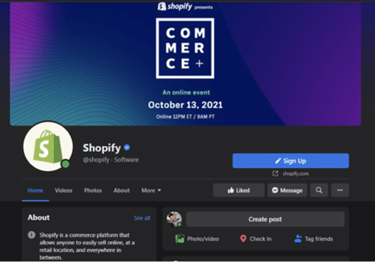
Another excellent example of social marketing is Shopify, which offers tons of resources for e-commerce business owners. By being a resource within the industry, Shopify builds brand loyalty because it’s evident that the company knows what it’s doing.
When managing your social channels, keep these tips in mind:
- Let Your Brand Persona Be Your Guide – All of your posts should fit within your brand personality. Here is where a keyword list can come in handy.
- Be Authentic – Don’t just post about sales or products. Offer some insight into your product offerings and deliver high-value content that will keep users coming back.
- Engage With Your Audience – Social media platforms are two-way streets, so you have to reply, like, and share posts from your followers. Otherwise, why should they interact with your business?
Step Seven: Document Your Brand Guidelines
As you grow your ecommerce store, you’ll have to rely on other people to handle your marketing strategy. So, it helps to develop brand guidelines now so that it’s easy for others to follow. Brand guidelines outline how your business should be represented across all channels, from SEO practices to social media marketing to site pages. The core elements of these guidelines should include:
- Assets – Here is where you put your logo and any other graphics you may use in advertisements and social posts. You should also have a photo and video library available.
- Color Scheme – Outline the different colors to use and when to use them. For example, blue may be for the homepage or social profiles, while black is used for product pages.
- Typography – Which fonts do you use for advertisements and product listings? Realistically, you’ll have one font for headlines and another for page text. You may also have a completely separate font for the brand logo.
- Voice – Be sure to outline your brand persona and the tone you want across all platforms and channels. Again, a keyword list is helpful in this situation.
Bottom Line
Now that you understand what it takes to brand your dropshipping store, you’re ready to go out and take on the world. Keep in mind that building an audience takes time, but success should be within reach as long as you follow these steps. Happy selling!
