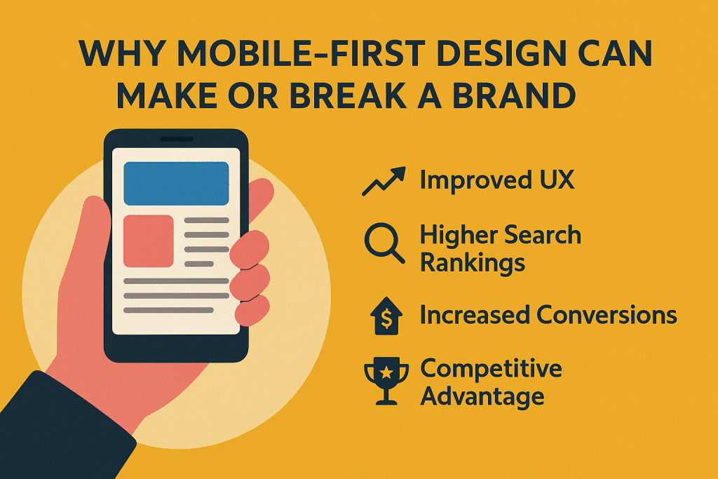
Desktop computers feel like dinosaurs while everyone runs their entire life through phones. Countless businesses still design websites for desktops, then squeeze mobile into whatever space is left over.
This backwards approach hemorrhages customers daily as phone users hit frustrating sites and instantly jump to competitors who figured out where people actually browse nowadays.
Companies paying for custom website design services are learning that starting with mobile creates better everything, not just phone experiences. Begin with tiny screen limits, then expand outward – works infinitely better than cramming desktop layouts into phone-sized boxes.
1. The Numbers Are Brutal
Over 60% of Australian web traffic comes from phones, climbing every single year. Facebook, Google, shopping – all happening on mobiles instead of computers gathering dust in spare rooms.
Business owners check emails on trains, research suppliers between meetings, and browse competitor sites from cafés after work. B2B companies pretending mobile doesn’t matter are missing the exact decision-makers they desperately want to reach.
Google buries non-mobile sites in search results because their algorithms know where searches actually happen. Desktop-only sites disappear into page-three obscurity where absolutely nobody looks.
2. Phone People Act Weird
Mobile users want answers fast and interactions simple. They’re juggling kids, walking between meetings, or killing time waiting for trains. Complicated menus and endless forms that work fine on computers become absolute nightmares on phones.
Patience evaporates completely on mobiles. Information better be scannable immediately and useful instantly. Dense paragraphs and layouts requiring scrolling in every direction make phone users bail faster than politicians avoiding tough questions.
Fingers aren’t mouse cursors. Buttons need proper spacing or people accidentally tap the wrong things constantly. Forms should use number keypads for phone fields and email keyboards for addresses – basic stuff that desktop-focused sites completely ignore.
3. Speed Becomes Life or Death
Phone internet varies wildly depending on location, network traffic, and device age. Sites loading fine on fast home WiFi might be completely useless on patchy 4G, especially outside major cities.
Every extra second of loading kills more mobile visitors than desktop users. Phone people won’t wait when competitors load instantly and provide what they need without delays.
Image compression, clean code, and fast servers become absolutely essential for mobile rather than nice bonuses. These technical bits directly determine whether potential customers can actually use business sites on their preferred devices.
4. Local Searches Live on Phones
“Near me” searches happen almost exclusively on mobiles as people hunt restaurants, mechanics, and shops while out and about. Businesses ignoring mobile local search miss customers actively seeking their exact services right now.
Mobile results show click-to-call buttons, GPS directions, and opening hours prominently. Sites displaying this clearly capture customers ready to spend money immediately instead of browsing casually.
GPS integration and local inventory checking only work through mobile-optimised sites. Desktop experiences can’t match these location-based advantages that mobile-first businesses use to crush competitors.
5. Everything Needs Connecting
Modern businesses need websites that talk smoothly to customer databases, inventory systems, appointment booking, and payment processing. Mobile-first design ensures these connections work properly, where most interactions actually happen.
Mobile-first design benefits extend beyond customer experience – business owners can monitor website sales on their phones, then quickly check financial impact using their software for accounting, managing everything efficiently from anywhere.
Critical for businesses operating online and physical locations. Customers browse on phones, buy online, and collect in stores. Every step needs to work perfectly on mobiles, or people abandon the whole process.
Bottom Line
Mobile-first isn’t trendy – it’s meeting customers where they actually are instead of where businesses wish they were. Companies prioritising mobile experience capture more leads, close more sales, and build stronger relationships than competitors still pretend desktops matter.
The mobile takeover already happened. Adapt now or watch customers disappear to businesses that did.
