

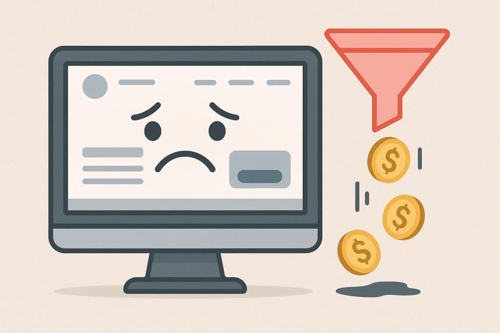
Consider a consulting firm whose website was genuinely well designed. Clean layout, good photography, consistent brand colors. The managing partner sent it to every new prospect the firm spoke with.
The site was also converting at under 1%. Not because it looked bad. Because looking good and performing well are not the same thing, and most people confuse them until the numbers make it undeniable.
This is one of the more frustrating problems to diagnose because the symptom is invisible. The site “looks fine.” So the issue must be the traffic, or the market, or the offer. The site gets a pass it has not earned.
The Difference Between Looking Credible and Being Convincing
A site can check every visual box and still fail to move someone toward a decision. Good design earns attention. It does not close deals.
What closes deals is specificity. A visitor needs to read the site and think: this is for someone like me, they have solved this exact problem before, and I know what to do next. If any one of those three breaks down, the visit ends without a conversion.
Most B2B sites nail the visual and miss all three.
The Most Common Structural Failures
The most common structural failures are not design failures. They are content and structure failures that design cannot fix.
The first is a homepage that speaks to everyone. When a site tries to address every possible visitor, it resonates with none of them. A 40-person SaaS company and a solo consultant have different problems, different budgets, and different objections. Copy written for both ends up working for neither.
The second is social proof that does not prove anything. Logos on a page are better than nothing. But a logo from a company the visitor has never heard of, with no context about what was actually done for them, is not convincing. It is decoration. Case studies that name the client, describe the specific problem, and show a real result are a different category of persuasion entirely.
The third is a CTA that asks for too much too soon. “Schedule a free strategy session” sounds reasonable. But to a visitor who arrived two minutes ago and does not yet trust the site, a 45-minute calendar commitment feels significant. The gap between where they are and what is being asked is too wide.
Every step a visitor is asked to take has to feel proportionate to how much they already trust the site.
What ‘Fine’ Actually Costs
Here is a concrete way to think about it. A site that gets 2,000 visitors a month and converts at 0.5% is producing 10 leads. At a 2% conversion rate, that becomes 40 leads. Same traffic budget, same ad spend, same content output.
That gap, 30 additional leads a month, is not a traffic problem. It is a site problem. And because the site looks fine, no one investigates it.
This is often the part that gets missed: budget keeps going into paid campaigns while the site is quietly losing half the people who actually click through.
The money is already being spent. The site just is not catching it. The Fixes Are Usually Smaller Than You Think
Fixing this kind of problem rarely requires tearing down a site. The structural issues that kill conversion tend to be specific and addressable.
Rewriting the hero section to name who the site is for and what outcome they can expect. Moving the primary CTA higher on the page and softening the ask (a short intake form or a case study download instead of a calendar link). Adding one or two detailed case studies with real client names and real numbers. Reducing form fields from eight to three.
None of these require a redesign. They require honest audit work and a willingness to make the site do a real job instead of just look like it is doing one.
This is exactly the kind of work that falls under growth management. Not a one-time project. Ongoing attention to how the site performs against the commercial goals it is supposed to support.
How to Know if This Is Your Problem
A few questions worth asking honestly:
If a first-time visitor landed on the homepage right now, could they tell within five seconds exactly who the business works with and what problem it solves? Not in general terms. Specifically.
Do the case studies include the client’s name, a description of the situation before the work began, and a measurable result? Or are they three sentences and a logo?
What is the single action a visitor is meant to take on the most important service page? Is it obvious? Is there only one?
If any of these prompt hesitation, the site has work to do.
A site that looks professional is table stakes. A site that converts is an asset. The design is rarely the real problem, but figuring out what is takes a structural look, not another redesign.