A strong online presence is crucial for nonprofits to effectively communicate their mission, engage supporters, and drive meaningful change. A well-designed website serves as the cornerstone of this presence, acting as a virtual hub for your organization’s activities, impact, and fundraising efforts. But what makes a nonprofit website truly effective? Let’s explore the essential features that every nonprofit website builder should incorporate to create a powerful online platform.
Clear Mission and Impact Display
Mission Statement: Your Digital First Impression
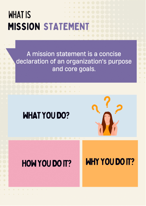
Your mission statement is the core of your organization and should be prominently displayed on your homepage. A concise mission statement communicates your purpose and goals, setting the tone for the user experience. Keep it brief, use simple language, and make it memorable. Ensure it is highly visible, ideally in the header or above the fold.

Impact Stories: Bringing Your Mission to Life
While the mission statement explains what you do, impact stories illustrate why it matters. Share testimonials, success stories, and case studies to highlight the tangible results of your efforts. Use a variety of formats, such as written stories, videos, and infographics.
Focus on personal stories to create emotional connections and include statistics to quantify your results. Regularly update these stories to keep the content fresh. Consider a dedicated “Our Impact” page or rotating stories on your homepage.
User-Friendly Design
Responsive Design
In an era where smartphones are ubiquitous, your website must be optimized for mobile devices. A responsive design ensures that your site looks great and functions smoothly on screens of all sizes. When choosing a nonprofit website builder, it’s essential to ensure they offer responsive design capabilities. This not only improves user experience but also enhances accessibility for a broader audience.
Key aspects of responsive design include:
- Flexible layouts: Use fluid grids that adapt to different screen sizes.
- Scalable images: Ensure images resize properly without losing quality or slowing down the site.
- Touch-friendly navigation: Design buttons and menus that are easy to use on touchscreens.
- Readable text: Use fonts and sizes that are legible on small screens without zooming.
Easy Navigation
Your website’s navigation should be intuitive, enabling visitors to find what they need in three clicks or less. Use clear, descriptive labels for menu items and implement a logical hierarchy of pages. Adding a search function for larger sites, including a sitemap, and using breadcrumbs can further improve navigation. Ensure consistency across all pages to provide a seamless user experience.
Engagement Tools
Blog and News Section
A regularly updated blog keeps supporters informed about your latest activities, improves search engine visibility, and provides sharable content for social media.
To maximize the impact of your blog:
- Post consistently: Establish a regular publishing schedule.
- Vary your content: Mix news updates, thought leadership pieces, and behind-the-scenes looks at your organization.
- Use visuals: Incorporate images, infographics, and videos to make your posts more engaging.
- Encourage interaction: Enable comments and respond to reader feedback.
- Optimize for SEO: Use relevant keywords and meta descriptions to improve search visibility.
Events Calendar
An events calendar is crucial for keeping your community engaged and informed. Whether you’re hosting fundraisers, volunteer opportunities, or educational workshops, a comprehensive calendar helps supporters plan their involvement.
Include clear date, time, and location information, brief descriptions of each event, and categories or tags to help users find relevant events. Provide registration or RSVP functionality and integrate it with popular calendar applications. Add social sharing buttons for each event to boost visibility and participation.
Email Sign-Up
Email remains one of the most effective ways to communicate with supporters. Prominently feature email sign-up forms to build your subscriber list for newsletters and updates.
Best practices for email sign-ups:
- Keep the form simple: Ask for minimal information (e.g., name and email address).
- Offer incentives: Consider providing a free resource or exclusive content in exchange for signing up.
- Use clear calls-to-action: Make your sign-up buttons stand out and use action-oriented language.
- Explain the benefits: Briefly describe what subscribers can expect from your emails.
- Place sign-up forms strategically: Include them in your footer, sidebar, and after blog posts.
Donation and Volunteer Facilitation
Donation Button
Ensure your donation button is highly visible and accessible from every page by using contrasting colors or larger fonts. Simplify the donation form by minimizing required fields and offering multiple payment options such as credit cards and PayPal. Provide suggested donation amounts while allowing custom contributions and explain how different donation levels translate into tangible results. Enable recurring donations to facilitate monthly contributions.
Volunteer Opportunities
Create a dedicated “Volunteer” page outlining current needs and explaining the application process. Describe roles in detail, providing clear expectations and requirements. Highlight the benefits of volunteering and showcase testimonials from current volunteers to inspire others. Ensure an easy sign-up process with an online form or volunteer management system, and offer virtual opportunities to accommodate diverse schedules and locations.
Social Media Integration
Social Media Links
Include icons linking to your organization’s social media profiles. This allows supporters to connect with you across platforms and stay updated on your activities.
Tips for effective social media integration:
- Choose the right platforms: Focus on the networks where your target audience is most active.
- Use consistent branding: Ensure your social media profiles match your website’s look and feel.
- Display social proof: Consider adding follower counts to demonstrate your community size.
- Place icons strategically: Include them in your header or footer for easy access.
Sharing Buttons
Add sharing buttons to blog posts and key pages to encourage visitors to spread the word about your cause. Prioritize relevant platforms by including buttons for the most popular networks among your audience. Use eye-catching icons that stand out without clashing with your site’s aesthetics.
Include share counters to encourage further sharing, and customize share text to pre-populate messages with engaging informative content. This helps maximize the reach and impact of your message.
Essential Information and Transparency
Contact Information
Ensure your contact details are easy to find on every page. This builds trust and facilitates communication with potential supporters, volunteers, and partners.
Key contact information to include:
- Physical address (if applicable)
- Phone number
- Email address
- Contact form
- Social media profiles
- Hours of operation (if relevant)
Financial Transparency
Publish summary financial statements and annual reports to demonstrate your commitment to transparency. This openness enhances credibility with donors and stakeholders. Provide clear financial summaries, explain how donations are used, and share your organization’s Form 990.
Include information about your board of directors and leadership team, and highlight any third-party ratings or accreditations. Transparency in financial matters fosters trust and encourages continued support from your community.
Security and Compliance
SSL Certification: Protect Your Supporters
Implement SSL certification to secure data transmission and build visitor trust. This is particularly important for pages that collect personal or financial information.
Benefits of SSL certification:
- Encrypts data transferred between the user and your website
- Improves search engine rankings (Google favors HTTPS sites)
- Builds trust with visitors through visual cues (e.g., padlock icon in browser address bar)
- Complies with payment card industry (PCI) standards for online transactions
Privacy Policy: Stay Compliant
Include a comprehensive privacy policy and cookie consent notice to comply with legal requirements and reassure visitors about the safety of their information.
Key elements of a nonprofit privacy policy:
- Types of information collected
- How information is used and protected
- Third-party sharing practices
- User rights regarding their data
- Contact information for privacy-related inquiries
- Cookie usage and management options
By incorporating these essential features into your nonprofit website, you’ll create a powerful online presence that effectively communicates your mission, engages supporters, and drives meaningful change. Remember to regularly review and update your website to ensure it continues to meet the evolving needs of your organization and its supporters.
FAQs
How can a nonprofit effectively showcase its impact on its website?
Nonprofits can showcase their impact through a combination of quantitative data (e.g., number of people helped, funds raised) and qualitative stories (e.g., beneficiary testimonials, case studies). Visual elements like infographics or short videos can also be powerful tools for communicating impact.
How often should a nonprofit update its website content?
Regular updates are crucial for keeping your site relevant and engaging. Aim to update your blog at least weekly, refresh impact stories monthly, and review static content (like your “About Us” page) quarterly to ensure all information remains current.
What security measures are essential for a nonprofit website?
At a minimum, implement SSL certification, especially for pages handling sensitive information. Regularly update your content management system and plugins, use strong passwords, and consider two-factor authentication for admin access. Also, ensure you have a clear privacy policy and data protection measures in place.
Conclusion: Building a Strong Foundation
A well-designed website is an invaluable asset for any nonprofit organization. By incorporating these essential features—from clear mission statements and impact stories to user-friendly design and robust engagement tools—you can create a powerful online presence that effectively communicates your mission, engages supporters, and drives meaningful change.
Remember, your website is often the first point of contact between your organization and potential supporters. Make sure it reflects the passion and professionalism of your nonprofit and provides a seamless experience for visitors to learn, engage, and contribute to your cause.
