
Your bedroom colours do so much more than make your space look pretty — they genuinely change how your body and mind feel in your environment.
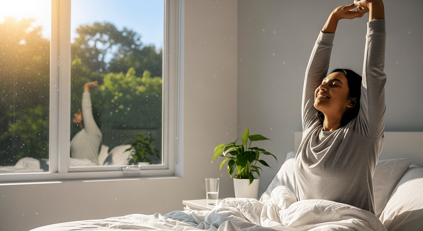
Did you know that blue bedrooms help people sleep for an average of 7 hours and 52 minutes compared to other colours? Yet the bedroom colour trends heading into 2026 are taking some truly exciting new directions.
This year, you’ll see softer and slightly muted blues winning over those crisp coastal shades, whilst warmer, more grounding earthy neutrals are appearing everywhere from walls to furniture and bedding. Dulux has even chosen a gorgeous trio of blues as their Colours of the Year, with stunning options like Free Groove™, Mellow Flow™, and Slow Swing™.
Here’s something that might surprise you: brown is making big waves for 2026. Although it probably isn’t your first thought for a bedroom makeover, it can actually be one of the most comforting colour choices you’ll make.
Whether you’re planning a complete bedroom refresh or just want to update your space with some new touches, understanding these latest bedroom trends really does matter. The colour you choose for your bedroom walls sets the mood for how you feel when you wake up and when you wind down each evening.
Throughout this guide, you’ll discover which modern bedroom colours are gaining popularity, how designers are actually using them in real homes, and most importantly, which colours the experts are quietly avoiding this year.
Why Bedroom Colours Matter More Than Ever
Colour isn’t just about making things look nice—it’s genuinely psychological. The shades surrounding you before you drift off to sleep have a real impact on your mind and body in ways that science is only just starting to understand properly.
The emotional role of colour in sleep and wellbeing
Colour psychology goes much deeper than simply liking how something looks, creating actual, measurable changes in how your body functions. Different colours create very different connections with and effects on people’s emotions. Your bedroom colours aren’t just decoration, they directly influence how well you sleep through both psychological and physical responses.
Here’s what’s fascinating: this connection works both ways. Colour affects how you feel emotionally, whilst your emotions have a huge impact on how well you sleep. Research shows that people going through emotionally difficult times experience poorer sleep efficiency and get less total sleep time. What’s more, being around calming colours before bedtime might actually boost your body’s melatonin production and help reduce those stress-inducing cortisol levels.
How colour choices affect mood and rest
The science behind this is quite remarkable. Blue environments genuinely help lower your heart rate and blood pressure, naturally getting your body ready for rest. It’s no wonder blue bedrooms help people achieve longer, better-quality sleep.
Green works differently but just as effectively. Green environments help you manage stress much better. Studies show we actually cope more effectively with stressful situations when we’re in rooms decorated with green tones. So, if you choose green for your bedroom, you’re likely to fall asleep feeling more relaxed and wake up properly refreshed.
But here’s the thing—some colours actively work against good sleep. Red actually raises your blood pressure and pulse rate, which makes it much harder to drift off peacefully, even though it might look stunning in other rooms. Bright, high-contrast colours send signals to your brain to stay alert rather than unwind.
Why 2026 is shifting towards cocooning spaces
The biggest change happening in bedroom design for 2026 centres around what designers are calling the ‘cocoon bedroom: padded, upholstered, and layered’. This represents a real shift away from designing bedrooms to impress others towards creating spaces that genuinely reflect your personality whilst supporting your emotional needs.
More and more designers are reporting that their clients want saturated, enveloping colours through colour-drenching—painting walls, trim, and ceilings all in one rich shade. This technique works because it eliminates visual noise by removing all those breaks in what you see. When you paint everything the same colour, your eye stops noticing where one surface ends and another begins, creating an immersive quality that’s particularly perfect for bedrooms.
People are craving spaces that feel more inviting and enveloping, so 2026 bedrooms focus on emotional wellbeing over just looking good, creating environments that actively help you rest through thoughtful colour choices.
The Bedroom Colour Trends Designers Are Quietly Embracing
Designers are quietly moving away from the safe choices of recent years towards colours that create real emotional connection in bedroom spaces. Here are the eight key palettes that will define 2026:
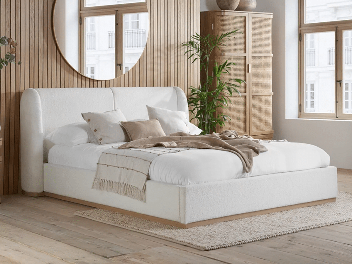
1. Taupe and warm neutrals
Taupe is having a major moment in 2026, bringing perfect balance and warmth to bedrooms. This sophisticated neutral works beautifully with crisp whites for a clean look or black hardware for instant visual depth. Consider Lick’s Taupe 03, the perfect backdrop for earthy greens and soft ochres. Use it on your main walls and introduce personality through bedding and accessories for maximum impact.
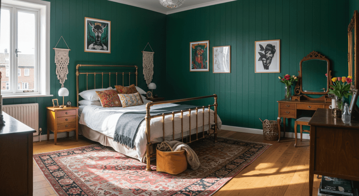
2. Sage and olive greens
Green continues its reign as the colour of nature, wellbeing and quiet restoration. For bedrooms, softer expressions—mossy mid-tones, olives or sage—prove most effective. These nature-led shades create a sense of enclosure without heaviness, especially when balanced with dark wood and understated neutrals. Valspar has named Sage Slate their 2026 Colour of the Year, celebrating its “naturally restorative and serene” qualities.
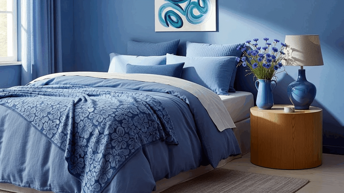
3. Dusky and denim blues
Softer and slightly muted blues have overtaken those crisp coastal shades we saw everywhere. Denim, powder and inky blues work wonderfully—particularly when balanced with warm metals and creamy whites to avoid a chilly finish. Dulux has released a trio of blues—Free Groove™, Mellow Flow™, and Slow Swing™—specifically designed to help you feel calm and connected to your space.
4. Terracotta and clay tones
Terracotta brings warmth, charm, and a lovely Mediterranean feel to bedrooms. These earthy reds range from intense brick tones to softer, faded shades that instantly make spaces feel more comfortable and cosy. The real magic happens when you pair terracotta with sage green, creating a perfectly balanced combination that feels both timeless and fresh.
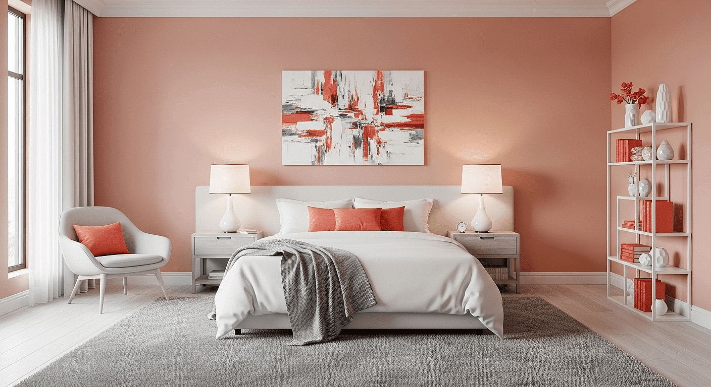
5. Soft blush and muted pinks
Soft and expressive, pink maintains its place as a modern neutral rather than a novelty colour. Dusty blushes and clay tones bring warmth without tipping into sickly sweetness, particularly flattering in bedrooms with ample natural light. These tones work beautifully with neutrals like cream and grey to create a balanced, sophisticated space.
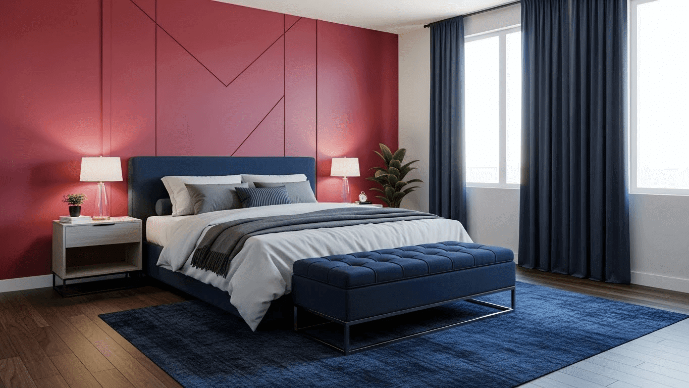
6. Deep navy and moody tones
Navy remains a dependable choice for those drawn to darker schemes. More refined than black yet equally dramatic, navy works brilliantly with both warm and cool accents. For a truly opulent bedroom, pair deep navy with gold or brass fixtures to add instant warmth and elegance. The result is both sophisticated and cosy simultaneously.
7. Cream and beige as modern neutrals
Cream makes a triumphant return after being notably absent from 2025’s most popular bedroom colours. This warmer alternative to bright white works best when embraced fully—layered with similar tones and natural textures. Beige, once unfairly labelled boring, has reclaimed its place as the go-to neutral for designers who crave calm interiors, excelling at creating a sense of continuity and harmony.
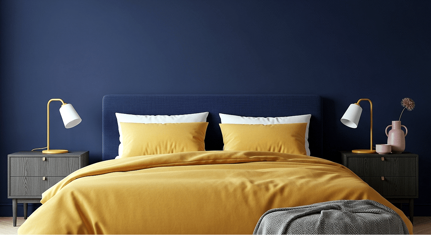
8. Grown-up primary colours
Primary colours—red, yellow and blue—are being reimagined for 2026 in more sophisticated ways. Instead of bright, overwhelming shades, designers are embracing warmer, playful versions—butter yellows, sophisticated blues—paired with cosy neutrals. The key is proportion, creating exciting equilibrium where curated primary hues are introduced with intent, not wild abandon.
How do you actually use these gorgeous colours in your bedroom?
Choosing the perfect bedroom colour is just the beginning. It’s how you apply these shades that makes all the difference between a space that looks nice and one that genuinely transforms how you feel.
Colour drenching for immersive calm
Colour drenching—painting your walls, ceiling, woodwork, and even radiators in one gorgeous shade—creates the ultimate cocoon-like environment perfect for rest. This technique works wonderfully with darker tones, creating an intimate, enveloping effect ideal for evening relaxation.
When you eliminate visual distractions where surfaces meet, your brain can properly wind down without competing colours fighting for attention.
Double drenching for subtle contrast
Want to take colour immersion even further? Double drenching uses two related but distinct colours throughout your space. This approach works best when you combine colours with variation in hue rather than strength.
Try pairing a deep blue on your walls with a slightly richer tone on trim and doors to create unexpected contrast whilst maintaining harmony. Little Greene, who coined this term, suggests this technique adds “design interest to a bedroom, drawing the eye to architectural details whilst remaining calming”.
Accent clusters for visual interest
Forget traditional accent walls—designers now favour “colour clusters” instead. These are strategic splashes of colour on architectural elements like alcoves, window frames, and doorways. This technique lets you experiment with bolder colours on a smaller scale whilst maintaining overall harmony in your bedroom.
Layer textures like linen and velvet for depth
Texture influences how your space feels as much as how it looks. Crisp fabrics suggest freshness, whilst smoother weaves introduce warmth. Why not combine percale (structured, hotel-inspired) with sateen (subtle sheen) to create tactile richness?
Adding textured elements—waffle weaves, velvet cushions, linen throws—introduces character w without competing with your colour scheme.
Use lighting to enhance colour warmth
Here’s something many people don’t realise: lighting dramatically affects how your bedroom colours appear. Warm lighting (2700K-3000K) beautifully enhances earthy tones like olive green, terracotta and taupe, whilst cooler lighting sharpens blues and greys.
Consider at layering light sources at different heights—table lamps, floor lamps, wall sconces—to build a soft, enveloping glow that makes colours appear richer and more nuanced.
Takeaway Tip: Start with one technique and build from there. Colour drenching is perfect for beginners who want maximum impact with minimum fuss.
What Designers Avoid (But Won’t Always Tell You)
Behind every bedroom trend sits an equally important list of colours professionals quietly steer clear of. Understanding these designer no-gos can help you make much smarter choices for your own space.
Why bright white is falling out of favour
Clinical bright whites create harsh, sterile environments rather than relaxing retreats. Most designers now prefer softer off-whites that still feel clean without that stark, laboratory-like quality that can actually disrupt your natural sleep rhythms.
The problem with bubblegum pink and chartreuse
Overstimulating neon-bright colours like bubblegum pink and chartreuse might look striking during the day, but they become proper visual irritants as evening approaches. These high-energy shades work against the calm you need for quality sleep.
When red becomes too intense
Pure reds, whilst bold and dramatic, raise your heart rate and blood pressure—exactly what you don’t need at bedtime. If you love this colour family, consider muted burgundy or rust tones instead.
Cool-toned greens that disrupt calm
Not all greens promote rest. Those with strong blue undertones can read as chilly and clinical, particularly in north-facing bedrooms with limited natural light. Stick to olive or sage variations with warming yellow undertones instead.
Overly crisp greys and their cold effect
Ultra-cool greys that dominated early 2020s bedrooms are steadily falling from favour. These tones often create emotionally flat spaces that feel unwelcoming rather than cosy—precisely what’s driving 2026’s shift toward warmer neutrals throughout the home.
Conclusion
Your bedroom colours really do go far beyond just making your space look beautiful. This year, we’re seeing such an exciting shift away from those clinical whites and cool greys towards colours that connect with how you feel.
Warm neutrals, sage greens, dusky blues, and gorgeous terracottas are taking centre stage because designers finally understand that your bedroom should actively help you rest, not just look pretty in photos.
The way you apply these colours matters just as much as which shades you choose. Colour drenching has become such a game-changer, wrapping your entire bedroom in one beautiful, calming hue that lets your mind truly switch off. It’s perfect for creating that cocooning feeling we’re all craving right now.
Think about it – your bedroom is where you start and end every single day. Doesn’t it deserve colours that actually support how you want to feel? Those bright whites and intense reds might work brilliantly in your kitchen or living room, but they’re working against you when it comes to getting quality sleep.
The bedroom colour trends for 2026 show we’re finally understanding how much our surroundings affect our wellbeing. Whether you fall in love with the restful calm of sage green, the sophisticated embrace of navy, or the grounding warmth of taupe, you’re creating so much more than a stylish space.
You’re crafting an environment that genuinely helps you sleep better, feel calmer, and wake up refreshed. After all, the perfect bedroom isn’t one that looks amazing on social media – it’s one that makes you feel amazing every single day.
FAQs
Q1. What are the top bedroom colour trends for 2026? The top bedroom colour trends for 2026 include taupe and warm neutrals, sage and olive greens, dusky and denim blues, terracotta and clay tones, and soft blush and muted pinks. These colours are chosen for their ability to create calm, cocooning spaces that support emotional wellbeing and rest.
Q2. How does colour affect sleep quality? Colour can significantly impact sleep quality through psychological and physiological responses. For example, blue environments have been shown to lower heart rate and blood pressure, naturally preparing the body for rest. Conversely, bright or high-contrast colours can signal the brain to remain alert, making it harder to fall asleep.
Q3. What is colour drenching and why is it popular for bedrooms? Colour drenching is a technique where walls, ceiling, woodwork, and even radiators are painted in one shade. It’s popular for bedrooms because it creates a cocoon-like environment that eliminates visual distractions, allowing the brain to wind down more easily. This technique is particularly effective with darker tones for creating an intimate, enveloping effect.
Q4. Are white bedrooms still in style for 2026? Bright white bedrooms are falling out of favour in 2026. Designers are moving away from clinical, stark whites towards softer off-whites and warmer neutrals. These create a clean look without the harsh, laboratory-like quality that can disrupt circadian rhythms and hinder relaxation.
Q5. How can lighting enhance bedroom colours? Lighting dramatically affects how bedroom colours appear. Warm lighting (2700K-3000K) enhances earthy tones like olive green, terracotta, and taupe, while cooler lighting sharpens blues and greys. Layering light sources at different heights, such as table lamps, floor lamps, and wall sconces, can create a soft, enveloping glow that makes colours appear richer and more nuanced.