It is important for a designer to understand trends: without them, sites will look outdated, and if you use too many of them, they will become unreadable. In this article, we look at what trends will be relevant in 2024 and how to combine them correctly.
Web design is a young direction in which relevance is important. The development of the field proceeds in waves, and if at first designers created sites overloaded with details, then moved to minimalism, now we are living through an era of bold decisions in interfaces. Therefore, there is a possibility that in the near future design will return to minimalism.
Ready-made mockups
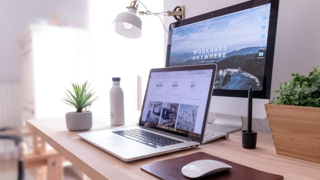
Ready-made mockups for your websites have been popular for many years, but this year they are a trend. First of all, users love this option because they do not need to hire a separate designer. For example, if you want to advertise your product on a MacBook screen – then you can take ready-made imac mockups to integrate your images into them. This solution allows you to save time, which is very valuable in our time.
- Features: ease of adaptation to any product and market, saving time, no need to hire a designer.
- Where to use: in any niche.
- Prospects: will be popular for many years.
Microanimation
Micro animations are noticeable when scrolling through the site – each animated element begins an action or interacts with other parts of the site. Both basic elements and those that are important for the resource infrastructure can be used: an icon, a burger menu, or a feedback form can be animated.
- Features: attracts and holds the viewer’s attention, and helps create the effect of a living website.
- Where to use: commercial sites where a little emphasis is needed.
- Prospects: will prove itself both in a commercial environment and in a creative one.
Creative copywriting
The idea of the site is laid out using text, and the design further illustrates it. It turns out that the meaning is conveyed through a visual metaphor: for example, the brand communications agency “Brick” with the slogan “We build brands that work.” The meaning is embedded not only in the slogan but also in the visual: a thick font was chosen, which is shaped like a brick.
- Features: design complements meanings rather than creating them.
- Where to use: in any niche.
- Prospects: will be popular in commercial niches.
3D objects
Such designs became especially popular in 2023, although they appeared on the market back in 2020. The wave of popularity will continue into 2024. However, such a design has a limitation: creating them is quite difficult since you need to own special 3D programs or have such a person on the team.
- Features: long process of creating 3D elements.
- Where to use: sites promoting one specific product or service, promotional sites, creative niches where you need to illustrate a product.
- Prospects: the trend will continue to develop and become more complex in future years – for example, in the form of three-dimensional sites with augmented reality.
Large typography
Most often, such a design includes massive forms and large fonts, on which the entire composition of the site is built. Typically, this style is combined with minimalism: basic colors and layouts are taken as a basis, and large fonts or photographs are chosen.
- Features: accent large font.
- Where to apply: any field of activity, except official portals.
- Prospects: combination with minimalism will make the trend more applicable to commercial projects.
Complex color schemes
The trend arose as a reference to the style of the 90s and 2000s, namely color schemes. For this purpose, unusual color combinations are used, for example, purple font on a pink or green background. As well as a large combination of colors within one site.
- Features: bright details.
- Where to use: creative projects, sites of urban spaces, creative clusters.
- Prospects: short-term trend.
To understand what trends are currently relevant and relevant, you need several years of practical experience and training. You can also track the main trends in fashion, photography, and social networks because this is where new trends arise. It happens to designers that, in pursuit of beauty or a trend, they forget about the true purpose of the project and do not take into account the target audience that will use it. For example, a bright, creative, and bold design will not be suitable for an ordinary conservative construction company, since its audience is men 45+: they will not appreciate such creativity and will leave the site. However, minimalism in design and proper structure will force them to study the materials. There are many trends, however, it is also worth distinguishing between short- and long-term trends. For example, Barbiecore in 2024 is unlikely to appeal to the audience, but minimalism with the addition of other trends will be relevant.
