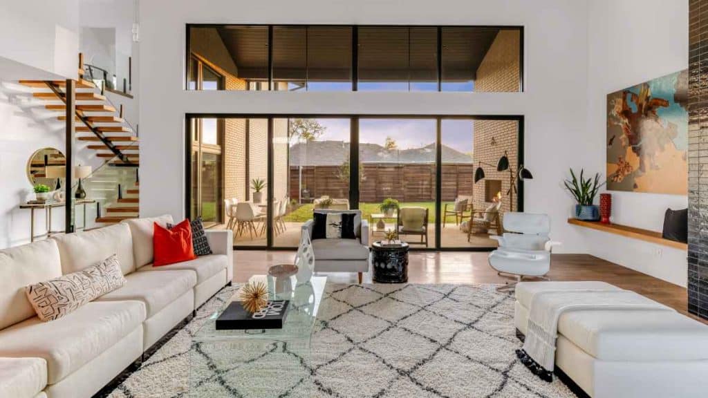
Interior design is an art form that requires skill and thoughtfulness. One of the most important elements of interior design is colour. Why? Colours have the power to set the tone, evoke emotions, and pull different elements together. Whether we’re talking dining chairs, wall art or high quality modern curtains in Melbourne, colour schemes can be used to create a cohesive interior design that looks professionally curated.
Understanding how to use colour schemes correctly is the key to creating a successful interior design. Let’s get started!
Start with the Basics
When selecting a colour scheme for your interior design, it’s important that you first consider the basics of colour theory. As a general rule, colours can be broken down into two categories: warm and cool. Warm colours include reds, oranges, and yellows while cool colours consist of blues, greens, and purples. You may also use neutrals like browns and whites as part of any colour scheme.
Monochromatic Colour Schemes
Monochromatic colour schemes are made up of one hue in various shades and tints. This type of colour scheme creates a unified look without being too overwhelming or boring. Monochromatic colour schemes work best when you choose one dominant hue and balance it out with lighter shades and darker tints, as this will create visual interest without any jarring changes in colours or tones.
Analogous Colour Schemes
Analogous colour schemes combine two or three hues that sit side-by-side on the colour wheel. For example, blue, green, and teal are all analogous colours because they are next to each other on the wheel; they share some commonalities while still having enough differences to create contrast and visual interest. Analogous colour schemes provide softer transitions between colours than complementary ones do, making them ideal for creating balanced yet exciting designs.
Complementary Colour Schemes
Complementary colour schemes consist of two hues located directly opposite each other on the colour wheel (e.g., red and green). These types of schemes tend to be bolder because they create stark contrasts between colours, which can give off an energetic vibe if done correctly. When using complementary colours for your interior design, choose one dominant hue with one contrasting accent hue for maximum effect without overwhelming your space with too much contrast or conflicting vibes from clashing hues.
Create Contrast
Once you know which colours you want to work with in your design, it’s time to create contrast! Different shades within the same hue can provide an interesting dynamic that adds visual interest without being overwhelming or overbearing. For example, if you are using a blue-based colour palette, try selecting both light and dark blues or even mixing in some purple hues for added depth and texture – this contrast helps make the room look more balanced and complete.
Add Accents
Accent pieces are great for adding pops of unexpected colour into any room. Whether it’s a blue accent wall or bright yellow throw pillows sprinkled throughout the space, these accents can help tie together all the elements in a room and create a cohesive whole. It’s important to choose accents that complement each other but also stand out from the main palette so that they emerge from the rest of the space without being too overwhelming or distracting from other elements in the room.
When done right, using colour schemes in interior design can transform any living space into something truly unique and special!
At its core, creating a cohesive interior design revolves around understanding basic principles of colour theory, and using those principles to create contrast between different shades within the same hue as well as adding accent pieces here and there for added visual appeal. With this guide as your starting point, you’ll be able to confidently create beautiful spaces full of vibrant colours that reflect your own personal style. Good luck!
