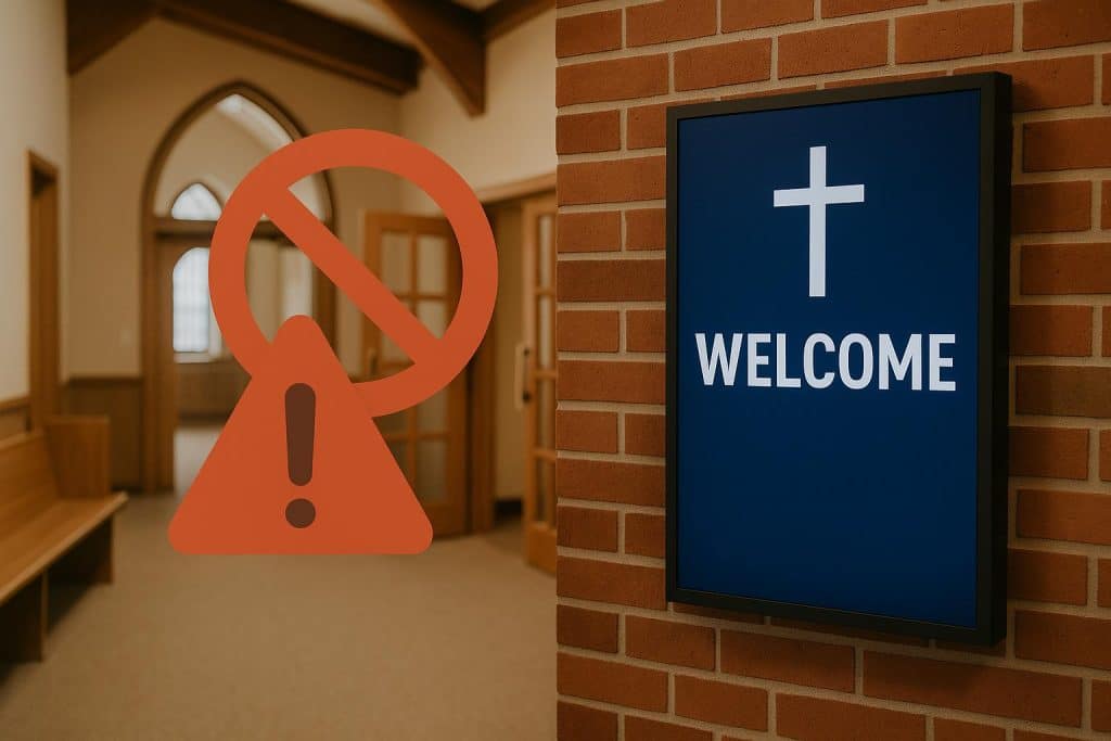
Signs inside a church help direct guests and members toward the right place without any confusion. Reliable online sources with exclusive items make the search for quality signs easier and quicker. Still, many people fall into common mistakes when choosing signs, especially when they shop in a rush.
Modern church signs offer clean looks, easy readability, and better ways to guide people through sacred spaces. Some signs just do not match the space or confuse rather than help those walking in. This article points out simple mistakes to avoid, so your church sign choice feels right from day one.
Designs That Feel Too Crowded
Some signs try to say everything all at once and end up saying very little that actually helps anyone. A crowded layout turns helpful information into noise, especially for someone passing quickly through a hallway. When letters fight for space or graphics fill every corner, attention quickly shifts elsewhere. Breathing room in a design allows clarity and creates a sense of calm.
Fonts or Colors That Reduce Clarity
A modern look means little if people cannot actually read the sign within a few seconds of walking past. Thin or overly stylized fonts might feel elegant, but often fail when viewed from ten or twenty feet away. Soft shades or poor contrast between the background and letters will blur the message even in good lighting. Strong, clear design choices matter far more than trendy options that only work up close.
Styles That Clash With the Church Identity
Each hall can have its own look, yet the overall style should still match the building’s shared tone. When a sign feels out of place, it creates confusion rather than unity across rooms, lobbies, and doors. Matching the material, shape, and finish with existing church features creates a stronger sense of belonging. A consistent style shows care and attention to detail, which people quietly notice as they move through spaces.
Messages That Try Too Hard
Some messages aim to entertain or impress and forget their real goal: guiding or informing with grace and clarity. A clever phrase might work for a poster, but a church sign benefits from being direct and simple instead. Guests might feel nervous or distracted, so clear guidance helps more than a joke or poetic wordplay. Stick with names, arrows, and direct cues; no one appreciates a riddle when looking for a restroom.
Poor Placement That Hides the Message
Even a perfectly designed sign fails if people cannot see it when they need to find the right space. It should not sit behind a door, below eye level, or tucked beside furniture where it disappears from view. Signs must catch attention naturally, especially when someone walks in late. Consider hallway traffic flow, lighting angles, and door swing when finalizing the placement.
Details That Overwhelm or Distract
Some signs feel like brochures; full of extra names, explanations, and numbers no one needs at that exact moment. Church hall signs should offer clear direction, not full event summaries, contact forms, or committee lists. Trim every extra word that does not serve an immediate purpose. A focused message gives people confidence without asking them to stop and study the wall for too long.
Some halls appear cold or unfinished without the right sign guiding people in gentle, helpful ways. Modern church signs make a space feel complete while offering clear paths through sacred or shared areas. See what fits your space, trust your eye, and choose what feels honest to your church.
