

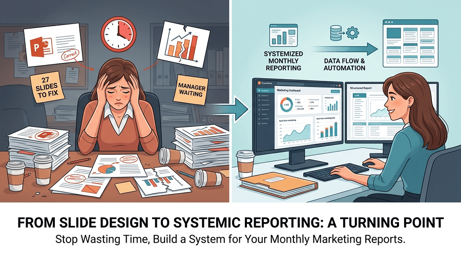
Last year I sent a proposal deck to a client and got back a one-line reply: “Can you resend this as an editable file?”
The deck looked fine. Clean layout, consistent fonts, the whole thing. But I’d downloaded a template from a random site, built everything on top of it, and apparently the “editable” .pptx it exported was anything but — half the text boxes were locked inside grouped objects, images weren’t sitting in proper placeholders, and the Slide Master was a complete mess. The client couldn’t change a single word without breaking something.
I spent two hours rebuilding it from scratch the next morning. Learned more about how PowerPoint templates actually work in those two hours than in the previous five years of using them.
Here’s what I wish someone had told me before that.
Not All Template Sites Are Worth Your Time
You already know this, but it’s worth saying clearly: most “free template” sites are SEO farms. Same 30 designs, different watermarks, buried behind three email capture forms. The ones that watermark your exported file after you’ve spent 45 minutes adding content are a special kind of frustrating.
The sites I actually go back to:
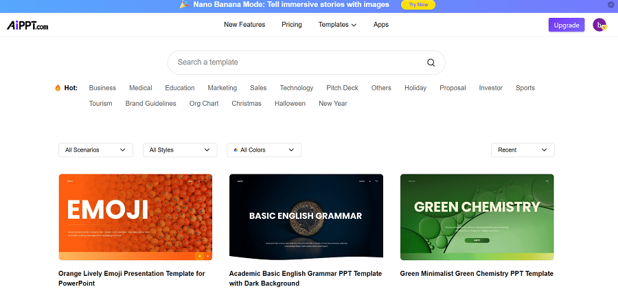
AiPPT is where I start for anything professional. The ppt templates library is organized by actual use case — pitch decks, training materials, executive summaries, quarterly reviews — not just by color palette. That distinction matters more than it sounds. When you’re looking for a template for a client proposal, you want something built around how proposal content is structured, not something blue that technically has the right number of slides. Exports as clean .pptx, no watermarks on the free tier, opens correctly in both PowerPoint and Google Slides. Those three things together are rarer than they should be.
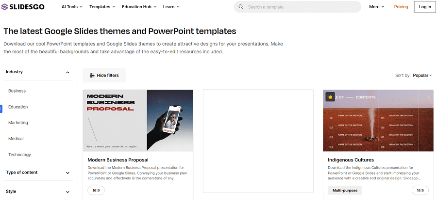
Slidesgo for anything education-related. The subject-specific filtering (actual subjects, like biology or history, not just “education”) is genuinely useful. Quality is consistently above average. Free account required, some premium options, but the free library covers most needs.
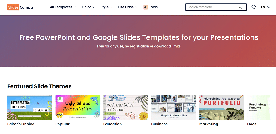
SlidesCarnival when I need something fast and don’t want to deal with an account. No sign-up. Minimalist designs that work as neutral professional bases. Good for internal decks where I’m not trying to impress anyone, just communicate clearly.
The Five Minutes That Save an Hour
I got burned enough times to develop a checklist I run before putting any real content into a template. Takes about five minutes. Has saved me from several hours of cleanup.
Check Slide Master first. Go to View > Slide Master in PowerPoint. This is where you see how the template is actually built. A well-built template has its font hierarchy, color system, and layout logic defined at the master level — meaning changes propagate everywhere automatically. A badly built template has everything hardcoded on individual slides as manually placed objects. The difference isn’t obvious from the outside, but it becomes very obvious the moment you try to swap a font or change a color across the whole deck. One takes 30 seconds. The other takes 30 minutes.
Test the font on the machine you’ll actually present from. This trips people up constantly. A template uses a custom font that’s installed on your laptop. You open it in the conference room, or on a client’s machine, or export to Google Slides, and suddenly every heading is in Times New Roman. Font substitution is silent — PowerPoint doesn’t warn you, it just swaps. Before adding content, open the template on whatever machine you’ll use on presentation day. If anything looks different, go into Slide Master and replace the fonts with something from the standard Office library.
Do the grayscale test. Windows: Settings > Accessibility > Color Filters > Grayscale. Mac: System Settings > Accessibility > Display > Color Filters. Switch your screen to grayscale and look at the template. If the text is still clearly readable and the layout still makes visual sense, it’ll hold up on a projector. If it turns into a gray smear — low-contrast text, backgrounds that bleed into body copy — you’ll have a readability problem in any room with overhead lighting. I’ve presented with bad contrast more than once. The audience doesn’t say anything. They just stop reading the slides.
Drop your actual content in before committing. Not placeholder text. Your longest paragraph, your most data-heavy table, your most bullet-point-dense slide. A template that collapses under real content is not a professional template. You need to know this before you’ve spent three hours building the deck, not after.
Build a Library, Not a Stack of Downloads
If you’re downloading a new template every time you need to make a presentation, you’re solving the same problem over and over. The first time you find a template that actually works — passes the checks above, holds up under real content, exports cleanly — save a clean copy with no content in it. Just the template, your brand colors if applicable, your logo if you use one. That’s your master file for that template.
Organize by use case. I have folders labeled: Client-Facing, Internal, Data-Heavy, Education. When a new deck comes in, I check my own library first. Takes thirty seconds. Usually find something. If not, then I go searching.
For teams, a shared Google Drive or SharePoint folder with validated templates eliminates the problem of everyone downloading slightly different versions of the same template and ending up with six decks that all look almost-but-not-quite the same. One folder, one master per template type, one naming convention.
This sounds like overhead. It pays back fast. The second time you use a validated template takes a fraction of the time the first use took.
Customize in the Right Order
Most people do this backwards. They open the template, start editing slides, change fonts on slide three, change a color on slide seven, adjust spacing on slide twelve. By slide twenty they have an inconsistent mess that still technically uses the template but doesn’t look like it.
Right order:
Go into Slide Master first. Change your fonts there. Change your colors there. If you want a logo on every slide, add it to the master layout, not to each individual slide. Everything you set in Slide Master applies everywhere automatically. Everything you set on individual slides applies only to that slide and breaks the moment you copy it somewhere else.
Then close Slide Master and work on your actual slides.
For images: right-click the image placeholder and use “Change Picture.” Don’t delete the placeholder and insert a new image. The placeholder is linked to the layout — it keeps your image in the right position relative to everything else on the slide. A loose inserted image is just floating there, and it will move on you at the worst possible time.
Save a clean copy before you add content. This takes ten seconds and means your next presentation on this template starts from a clean base instead of from a copy of this deck with all your content stripped out.
Where AI Actually Fits Into This
AiPPT has an AI generation layer that I’ve started using for first drafts. You give it a topic, audience, and tone — formal, instructional, conversational — and it builds a complete structured deck using one of the template layouts as the visual base.
What it’s good for: structure. For a 20-slide deck on a topic I haven’t presented before, having a logical outline already in slide form is faster than building it from scratch. I spend maybe 15 minutes editing the structure, then replace the AI-generated content with my actual material. The template formatting is already applied. The slide hierarchy is already there. I’m doing content work, not layout work.
What it won’t do: know your specific data, your client’s specific situation, your argument. It generates structurally reasonable placeholder content. You still have to write the real thing. That hasn’t changed. But starting at 60% done is faster than starting at zero, especially for presentation types you don’t build regularly.
The Thing Nobody Mentions About Template Efficiency
The goal isn’t to build one presentation faster. It’s to make the formatting problem disappear as a category.
When I’m working in a template I’ve validated, customized at the master level, and used before, I stop thinking about the design entirely. The slides look right automatically. I’m just writing. That’s the actual payoff — not 20 minutes saved on a single deck, but a permanent reduction in the mental overhead of presentation work.
Find two or three templates that work for your most common use cases. Run the checks. Browse powerpoint templates free download options until you have what you need. Build your master files. Then stop solving the template problem and start spending that time on the content.
The formatting will take care of itself.