Front-end developers bring designs to reality with code. That doesn’t necessarily mean that developers are good at the design part.
But the tech domain is more dynamic now than it has ever been before. New technologies, the latest trends, evolving best practices, and designers who are now learning front-end developer skills, make it tough to keep your job.
And in the less-than-ideal world that we live in, it often happens that front-end developers have to come out of their comfort zones and make small, but significant design changes.
Of course, when you are working in a front-end developer remote role, you cannot turn around and ask the designer to fix the minor design issues. You’ve gotta do it yourself.

So to make sure you keep your job and stay good at it, you ought to know more than just front-end development languages and skills. You need to learn design too. At least the basics.
Does that mean you have to go to a design school now? Or take pricey courses? Or spend nights bent over design books?
No.
As a front-end developer, all that you need to know about designing is summed up in 5 simple rules.
On to the 5 front-end design rules that will simplify your life as a developer –
1. Hop on the hierarchy horse

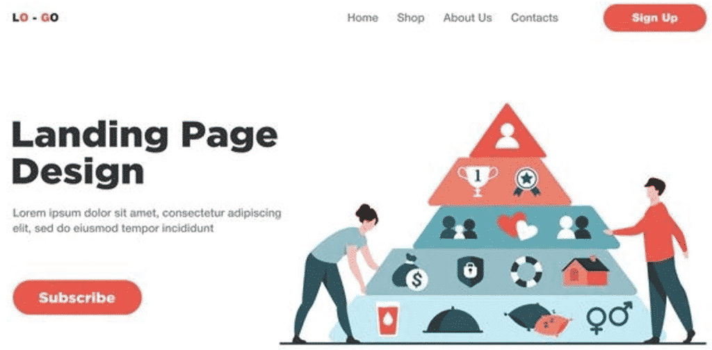
Every Internet user is faced with an information overdose. There is just too much information available. As a front-end developer, your aim should be to show your audience what matters most to them (and what your employer wants them to see first).
The only way that happens is if the page layout follows a hierarchy.
Important content should come first. It should be bigger. And highlighted.
While it is a simple design principle, it is difficult to implement. Otherwise, we would have been looking at perfectly designed pages all across the web.
So to make the hierarchy principle (easily) actionable, let’s break it down.
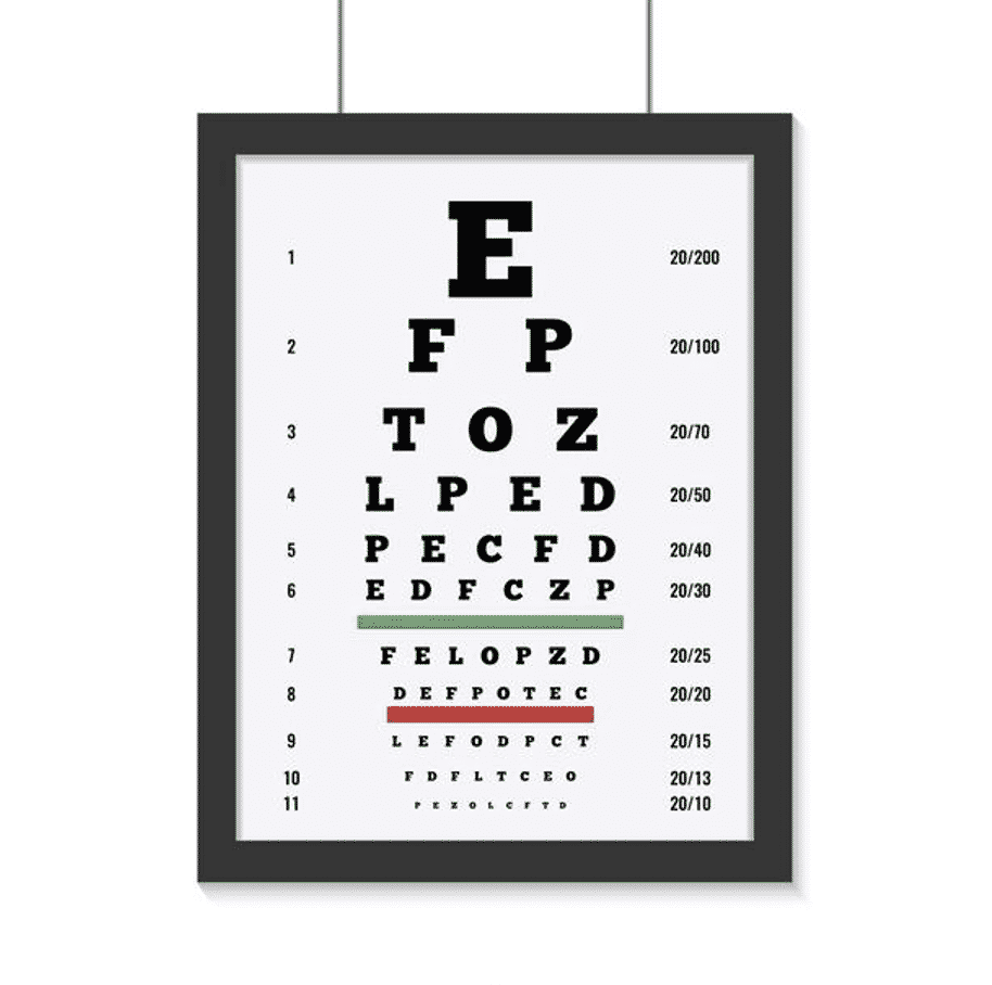
- Make the title bigger. But hold your horses and don’t make things extremely large, which will make them look out of place.
- Sometimes when you want to emphasize certain parts of the page, but cannot make the text any bigger, turn to font-weight.
- If you feel that everything on the page is important, don’t enlarge everything. Prioritize. If everything screams for attention, nothing gets the attention.
- No matter how tempted you are to use different fonts to highlight text, resist the urge. Diverse fonts are distracting and break the flow of reading.
- Don’t shy away from playing with colors in the design. But use no more than 3 different colors. There should be one basic color, one darker variant for titles, and key points, and one contrasting accent color to bring attention to key terms. Use the latter two only sparingly to keep their effect intact.
2. Keep readability your priority

Employers hire front-end developers like you to get the user interface codified. You being able to design the UI/UX is a plus. You can still get hired without design skills (though be prepared for a lower pay!). But someone without knowledge of front-end development languages won’t ever be able to sit in your seat.
Similarly, the main goal of front-end designing is not aesthetics. It is readability. Make sure you keep it your priority.
Here’s a readability specific checklist that you should follow before finalizing your design:
- Can the reader understand the most important parts even if they aren’t paying 100% attention?
- Does the content on the page look equally good on all device types and screen sizes?
- Are their walls of text on the page? If yes, remove the walls as they make reading feel tedious. Add white space to make the reader feel comfortable and at ease.
- Did you follow a consistent alignment pattern? Left alignment is the norm and you should use center alignment only when the content fits in less than 2 lines. Justified alignment should seldom be used for digital content as it creates unwanted spaces between words. Leave it for academia.
- Are there design elements on the page that divert the attention away from where you want the viewer to focus? It could be a cool graphic or a video that automatically starts playing. And no matter what it is either fix it or remove it.
3. Know when to be flexible and when not
Flexibility is overrated. Change is never easy. And we find the maximum comfort in things that are ‘usual’ or ‘regular’.
Make sure you factor that into your front-end design.
Now that doesn’t mean all the designs you ever work on in your career should look like close cousins. But for each project, decide on front-end design templates, typography, and patterns that will act as the base.
Here are some elements you should define before getting started:
- Font size
- Font weight
- Font height
- Line height
- Font color
- Padding
- Background colors
- Margins
- Shadows
- Opacity
Once defined, think twice before changing any of that. A good rule of thumb is to stick to the pre-designed values.
4. Ensure your designs are mobile-first

Okay, sorry for stating the obvious. But here’s your reminder to make sure your front-end design patterns and elements are all mobile-first.
Cramming up tons of elements, using abnormally large elements and fonts, and not leaving enough margins on either side, will backfire in the mobile view.
And instead of correcting these issues for mobile devices, you should design keeping the mobile view in mind.
Here are a couple of things to consider while doing that:
- Say no to text-heavy pages
- Give proper spacing and include white space
- Have buttons on the page? Make sure you are easy to click with the thumb. Placing them within reach of the right thumb is always better.
- Bid big elements adieu, unless they can be down-sized.
- Always compress the images and other media to ensure quick loading
5. Take a component-based approach
Instead of working on design monoliths that are tough, tedious, difficult to scale, and lack any flexibility, adopt a component-based approach.
A component-based approach is a modular approach that breaks down the monoliths into singular elements.
Here are a few component-based approach best practices to follow:
- Create universally acceptable components. These are components that can be used not just for the first few screens you develop. These can also be used years down the line when the website/application has scaled and changed.
- If you have a front-end monolith, to begin with, don’t break it down in one go. Decouple elements in blocks and turn them into components.
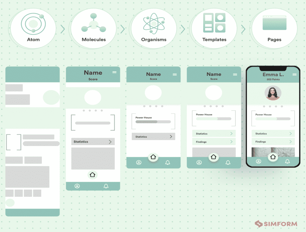
- Use Brad Frost’s atomic design. Use atoms, molecules, organisms, templates, and pages for nomenclature of components as shown below:

It might take some time to get used to the component-based approach, but once you get in the habit, things will flow pretty smoothly from there.
Start implementing what you learned today
With that, you are done with the basics of front-end design concepts and design elements.
However, don’t make this guide becomes the end of your learning endeavors. Stay tuned to the media outlets that report the latest design trends and best practices. Plus, stay upbeat with new design technologies and tools.
And now it is time to put what you learned to practice and hone your skills. Good luck!
Appendix
Sources
- https://www.toptal.com/front-end/front-end-design-principles
- https://medium.com/swlh/front-end-principles-for-designers-acb195495809
- https://clearleft.com/posts/front-end-design-principles
- https://code.oursky.com/web-front-end-basic-styling-practice/
- https://dev.to/adrianmanea/3-design-principles-for-frontend-developers-nc0
- https://xd.adobe.com/ideas/principles/web-design/front-end-ux-design-for-developers/
- https://www.simform.com/blog/principles-of-scalable-front-ends/
- https://css-tricks.com/principles-for-user-centered-front-end-development/
- https://www.door3.com/blog/front-end-development-trends-and-best-practices-part-i-from-design-to-mobile-integration
