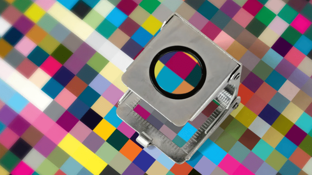
Color management is a multifaceted aspect of professional photo printing, serving as the nexus where digital artistry converges with tangible expression. In this exploration of color profiles, calibration techniques, and strategies for ensuring print fidelity, we delve into the intricate world of color management and its profound impact on the visual storytelling of artists and photographers.
Introduction: The Palette of Possibilities
Imagine a world where the hues of your digital creation seamlessly transition from screen to print, where every shade and tone retains its vibrancy and depth. This is the promise of color management—a symphony of precision that transforms pixels into art.
In this journey through the realms of professional printing, we embark on a quest to unravel the mysteries of color fidelity, from the selection of color profiles to the fine-tuning of monitors and printers. Join us as we uncover the nuances of color management and equip you with the tools to bring your artistic vision to life.
Decoding Color Profiles: The Language of Color
At the heart of color management lies the concept of color profiles—a digital language that governs how colors are interpreted across different devices. Much like dialects in a linguistic landscape, these profiles vary in their scope and capabilities, each offering a unique palette of colors to the discerning artist.
- sRGB: The Standard Red Green Blue (sRGB) color space serves as the lingua franca of digital imagery, offering a standardized color gamut suitable for web and general use.
- Adobe RGB: With its expanded color range, Adobe RGB caters to the discerning eye of photographers and artists, providing a broader spectrum of hues for nuanced expression.
- ProPhoto RGB: The grand maestro of color spaces, ProPhoto RGB unlocks the full potential of digital artistry, offering an expansive canvas for boundless creativity.
Understanding the nuances of these color profiles is essential for artists seeking to maintain fidelity and consistency across their digital and printed works.
The Art of Calibration: Harmonizing Screens and Prints
Monitor calibration, which makes sure that the image you see on your screen is an exact depiction of your digital artwork, is a crucial component of colour management. Monitor calibration is like fine-tuning an instrument before a symphony—it balances the visual harmony of your creative process.
- Hardware Calibration: Utilizing specialized tools such as colorimeters and spectrophotometers, artists can calibrate their monitors with unparalleled precision, adjusting parameters such as brightness, contrast, and color temperature to achieve optimal visual fidelity.
- Software Solutions: For those without access to hardware calibration tools, software-based calibration solutions offer a viable alternative, providing step-by-step guidance for adjusting monitor settings to achieve accurate color representation.
By calibrating their monitors, artists can establish a solid foundation for color management, ensuring consistency and accuracy throughout the creative process.
Bridging the Divide: Ensuring Print Parity
As digital artworks transition from the virtual realm to the tangible medium of print, maintaining color fidelity becomes paramount. This necessitates a meticulous approach to print preparation, encompassing soft proofing, ICC profiling, and printer calibration.
- Soft Proofing: Through the process of soft proofing, artists can simulate how their digital artwork will appear when printed, allowing for adjustments to be made to color, contrast, and brightness to achieve the desired aesthetic.
- ICC Profiling: ICC profiles serve as blueprints for color reproduction, providing printers with precise instructions on how to interpret and reproduce the colors present in digital artwork. By utilizing ICC profiles specific to their chosen printer and paper combination, artists can ensure consistency and accuracy in their prints.
- Printer Calibration: Just as monitors require calibration, printers must also be calibrated to ensure accurate color reproduction. By regularly calibrating their printers using tools provided by manufacturers or third-party calibration solutions, artists can maintain consistency and fidelity in their printed works.
By embracing these techniques and integrating them into their workflow, artists can bridge the divide between the digital and physical realms, ensuring that their printed artworks faithfully capture the essence of their creative vision.
Conclusion: The Artistry of Color Management
In the tapestry of professional printing, color management serves as the cornerstone upon which artistic vision is realized. From the selection of color profiles to the meticulous calibration of monitors and printers, every aspect of the process contributes to the creation of vibrant, expressive works of art.
