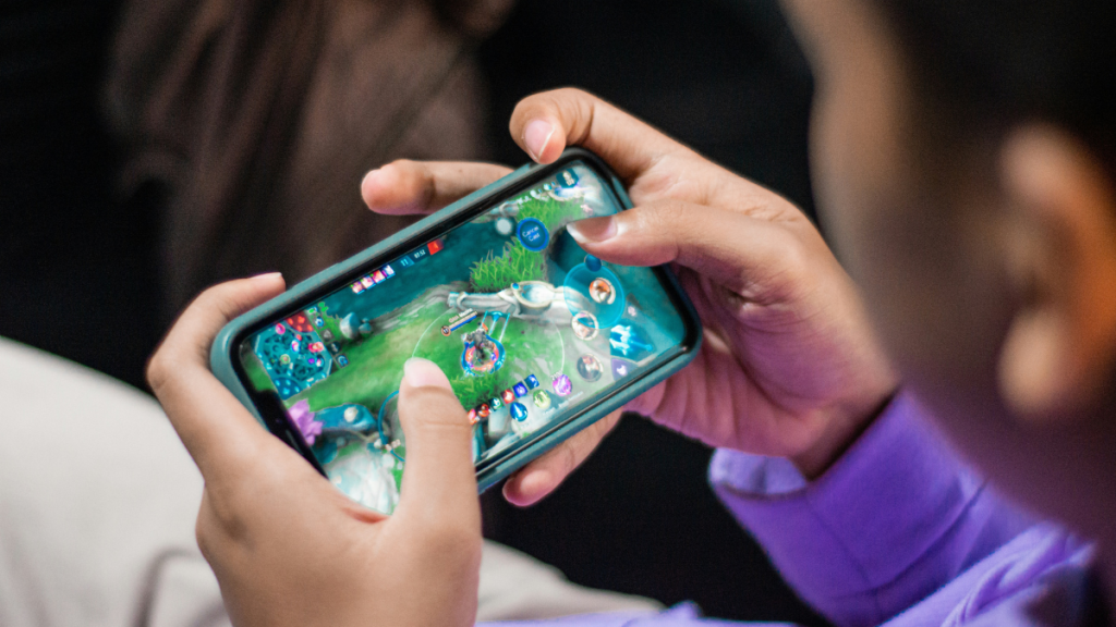
It’s remarkable, really. Last year the global games market surpassed $182.7 billion, and a huge part of that boom stems from games’ visual hooks. Why do certain interfaces pull us in so effortlessly?
Well, colour is at the heart of what keeps us staring at screens well past “just one more level.” From sprawling open worlds to hyper-casual puzzle apps, visual design is the silent narrator of our digital journeys. Might it feel subtle? Sure, but it’s sneakily persuasive. It’s not magic dust—it’s a psychological playbook.
The Power of Hues: Shaping Player Emotions
Game designers know exactly how red spikes heart rates while blue invites calm exploration. These connections go back to our evolutionary wiring—warm tones signal urgency and cool tones promise safety. I still get a jolt when a bonus round blazes in fiery tones; it’s almost Pavlovian. This tuning of hues isn’t mere aesthetic fluff—it’s a strategic tool in every pixel. In fact, research shows that colour increases brand recognition by up to 80 percent, so you can imagine the pull it exerts in-game.
Guiding the Gaze: Visual Hierarchy in Action
Picture a sprawling RPG map, or even a mobile puzzler—you’ll invariably look first at glowing quest markers or flashing loot chests, usually in bold, contrasting shades. This visual hierarchy keeps our attention locked where it matters, and prevents cognitive fatigue. Subtler background palettes then recede, making essential elements pop without extra effort on our part.
Spotlight on Slots
Let’s zoom in on the casino side—visually vibrant slot games like Sweet Bonanza. There’s something about the cluster-pays mechanic paired with tumbling reels that triggers an almost sugar-high rush.
Candy themed games, specifically, lean hard into nostalgia with pastel palettes that flood the retina. I remember the first time I spun those bright pink and turquoise symbols—my pulse actually picked up, no kidding.
Developers often test dozens of palettes before landing on that sweet spot—pun intended.
Consistency and Branding: Beyond First Impressions
It’s not just about a flashy intro; consistent colour schemes forge strong brand identities. Mirror’s Edge perfected its crisp red-on-white look, and you recognized it from the trailer alone.
Candy themed games double down by syncing every icon, button, and background with a cohesive sugary look—so you feel like you’ve stepped into a candy store designed by Pixar.
Subconscious Priming and Player Behavior
Ever wonder why reward icons often glow in gold or green? That’s colour psychology gamified.
Gold insinuates value, green signals go-ahead. These cues subconsciously prime us to chase those bonuses—and trust me, it works like a charm. Sure, it feels slightly manipulative, yet we’re right there hopping back in, chasing that neon-bathed jackpot.
Colour isn’t an afterthought; it’s the unsung hero that makes us linger, engage, and return. Next time you can’t tear your eyes away from a bonus spin or a dynamic UI element, remember: it’s not magic, but a carefully chosen palette speaking directly to your brain. Whether it’s the neon thrill of jackpot screens or the nostalgic glow of candy-themed games, colour psychology is always at play.
What hue sends your pulse racing? Drop a comment below and share your story—we’d love to hear which shades (or candy colours) have you hooked.
